Accessibility
EdTech that is properly designed and coded so that learners with disabilities can use it.
Reference: https://www.w3.org/WAI/WCAG21/quickref/
EdTech that is properly designed and coded so that learners with disabilities can use it. Accessibility is not a feature — it is a constraint that improves the product for everyone. Captions help ESL learners; high contrast helps learners in bright classrooms; keyboard navigation helps power users.
Ensure sufficient color contrast for all text and interactive elements
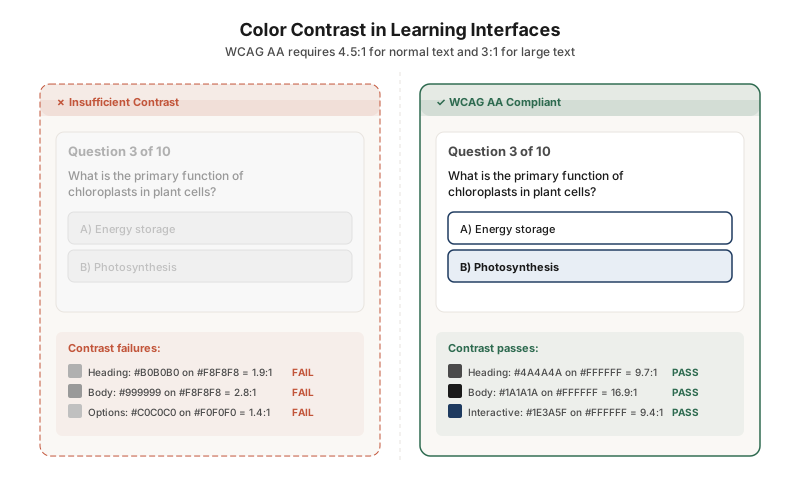
This side-by-side comparison shows the same quiz with insufficient contrast (left) and WCAG AA-compliant contrast (right). The failing version uses light grays that wash out under classroom lighting or for learners with low vision. The fix is straightforward: higher contrast ratios that make content readable for everyone.
Build semantic structure that screen readers can navigate
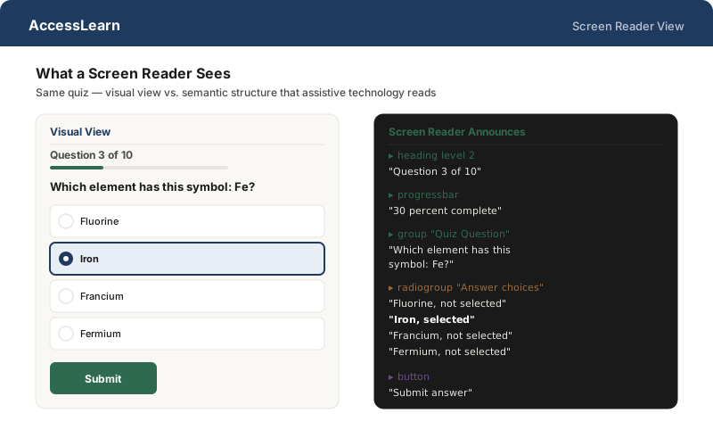
The same quiz looks completely different to a screen reader. The visual view relies on spatial layout; the screen reader view relies on semantic HTML — headings, radio groups, progress bars, labeled buttons. If the code lacks these semantics, a blind learner hears a flat stream of unlabeled text.
Provide captions and interactive transcripts for all video content
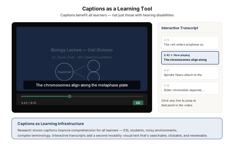
Captions are not just a compliance checkbox — they are a learning tool. This video player pairs synchronized captions with a clickable transcript panel. Learners can click any transcript line to jump to that point in the video, turning linear video into a navigable, reviewable resource. Research shows captions improve comprehension for ESL learners, learners in noisy environments, and anyone encountering complex terminology.