Navigation
Designing for different means of navigation — screen readers, low dexterity, and alternative input devices.
Reference: https://www.w3.org/WAI/WCAG21/quickref/#keyboard-accessible
Designing for keyboard, screen reader, and alternative input navigation is not merely a compliance requirement — it forces a clarity of structure that benefits all users. If a page does not make sense when navigated linearly by keyboard, it probably has structural problems that sighted mouse users are working around without noticing.
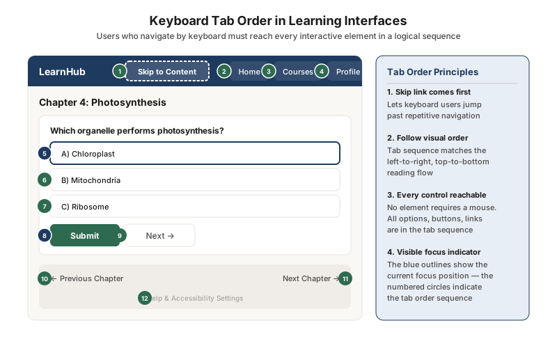
Ensure every interactive element is reachable via keyboard in a logical tab order
This learning page shows the complete tab order — every interactive element numbered in the sequence a keyboard user encounters them. The skip link (Tab Stop 1) lets users bypass the navigation to reach the main content directly. The tab sequence follows the visual reading order: left to right, top to bottom.
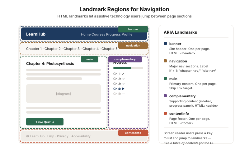
Use ARIA landmark regions so assistive technology users can jump between page sections
This wireframe shows the five landmark regions that structure a learning page: banner, navigation, main, complementary, and contentinfo. Screen reader users can list and jump to any landmark, navigating a complex page the way sighted users scan a visual layout. If a page has only one landmark (or none), assistive technology users must navigate linearly through every element.
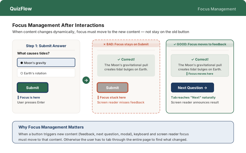
Move focus to new content when interactions change the page
When a learner submits an answer, the feedback panel appears — but where does keyboard focus go? The bad pattern leaves focus on the now-irrelevant Submit button; the good pattern moves focus to the feedback, so the screen reader announces the result and the next Tab press reaches the “Next Question” button naturally.